Digi.
Is this sad  Cookie Eating Level: Professional
Posts: 320
|
Me tbh
Feb 23, 2009 12:33:05 GMT -5
Post by Digi. on Feb 23, 2009 12:33:05 GMT -5
|
|
|
|
Me tbh
Feb 23, 2009 12:36:36 GMT -5
Post by Majortopio on Feb 23, 2009 12:36:36 GMT -5
oh shit is that a flower growing out of his head?!
Anyways, I like the pieces. You could use a few more details to make them more interesting... but they're very colorful and entrancing.
|
|
Parker
Is this sad 
Posts: 1,241
|
Me tbh
Feb 23, 2009 12:42:25 GMT -5
Post by Parker on Feb 23, 2009 12:42:25 GMT -5
First one I loveee, the concept and everything well done! 3rd and 4th I like very muchos as well, the colours, depth and shape are great! Well done  |
|
|
|
Me tbh
Feb 23, 2009 12:48:17 GMT -5
Post by Slayer on Feb 23, 2009 12:48:17 GMT -5
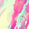
I Love the first one and the last one..ITS PINK!
Anyway yeh I love them very imaginative and I love the whole idea of them xD
|
|
Parker
Is this sad
Posts: 1,241
|
Me tbh
Feb 23, 2009 12:50:09 GMT -5
Post by Parker on Feb 23, 2009 12:50:09 GMT -5
Oh sorry didnt notice the last one, but I notice its vertical in your signature, I think it looks much better like that. The way the colours blend in to each other are great and that circle just top's it off  |
|
Sunjo
Administrator 
Posts: 1,914
|
Me tbh
Feb 23, 2009 12:50:25 GMT -5
Post by Sunjo on Feb 23, 2009 12:50:25 GMT -5
The anatomy of the first looks weird. o.O
Nice tags however.. personally I love 2 & 4.
Only thing I see you lack right now is accurate lighting, some of the lighting techniques used in those tags could use some improvement, and the areas you choose for light to shine is inaccurate in some spots. (like #4)
Even still, my personal favorite is 4.. amazing work man.
|
|
Kronus
Is this sad  I raped Sven
The Savior
Posts: 531
|
Me tbh
Feb 23, 2009 12:51:46 GMT -5
Post by Kronus on Feb 23, 2009 12:51:46 GMT -5
Mm, I figured you'd go by that name.
Very nice, like I said on MSN.
|
|
Shine
Is this sad
The Murderer
Sarcasm Level: Epic
Posts: 262
|
Me tbh
Feb 23, 2009 20:11:18 GMT -5
Post by Shine on Feb 23, 2009 20:11:18 GMT -5
Pretty good stuff. Decent concepts, flow, colors. Nice smudge style, kind of reminds me of mine. Keep at it. |
|
Beebs
Is this sad  I've grown tired of this mortal shell! *flies away*
Posts: 144
|
Me tbh
Feb 24, 2009 1:09:23 GMT -5
Post by Beebs on Feb 24, 2009 1:09:23 GMT -5
That 1st one is sexy as hell, and while the rest are still pretty great, not exactly my personal taste due to the lack of... things, I guess. Not much to look at, but the beautiful smudgework. My only real gripe is at the top of the 2nd, with the faded circles, which look kind out of place to me. I don't think I have to right to be critiquing you though, as it's pretty clear you're a lot more skilled than I am. xDD These are all awesome, tbh.
|
|